Enlace Solidario: Identity for Collective Action
Brand identity and visual system for Enlace Solidario, a grassroots support network that connected volunteers, local businesses, and families across Turdera, Buenos Aires during the pandemic. Designed to feel human, trustworthy, and community-built, the system translated solidarity into something visible, recognisable, and easy to rally around.

A neighbourhood that organised itself
During the 2020 lockdown, a group of neighbours in Turdera formed a support network to reach families who couldn't leave their homes, delivering food and medicine, providing phone companionship to isolated elderly residents, and offering remote tutoring to children without connectivity.
The identity needed to reflect that spirit: local, human, trustworthy, and built around connection as collective infrastructure.
Connection as infrastructure
The symbol encodes a layered system of meaning: a hexagon representing structure and community, a central handshake signaling mutual support, and upward chevrons expressing the momentum created through collective action. Two versions — gradient on light, white on gradient — ensure the mark works across every application without compromising legibility or intent.
Primary logo in two versions: gradient symbol on light background for print and digital applications, and white monochrome on brand gradient for high-impact contexts.
Precision behind the form
The construction grid defines proportional relationships and radius values that govern the mark at every scale. The isometric grid aligns the hexagonal container, chevron forms, and handshake elements into a unified structure, ensuring the logo holds its integrity from 16px favicon to billboard.
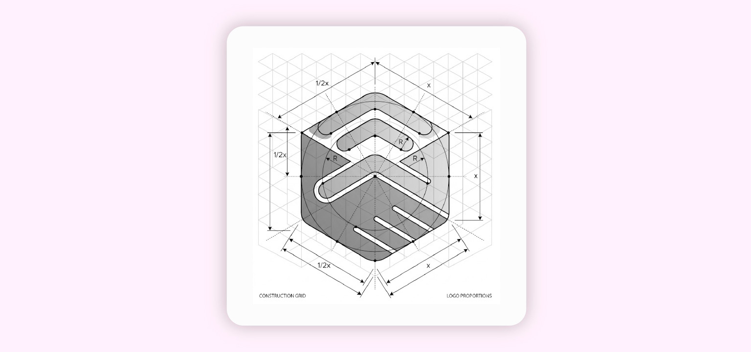
Construction grid — isometric base, proportional measurements (x and 1/2x), and corner radius values defining the symbol's geometry.
A palette built for warmth and trust
Purple as the primary anchor conveys trust and institutional weight. Magenta brings energy and urgency. Gold signals community and warmth. Usage ratios prevent the palette from overwhelming — purple carries 60% of the visual load, keeping the system grounded while letting accent colours do targeted work across communication pieces.
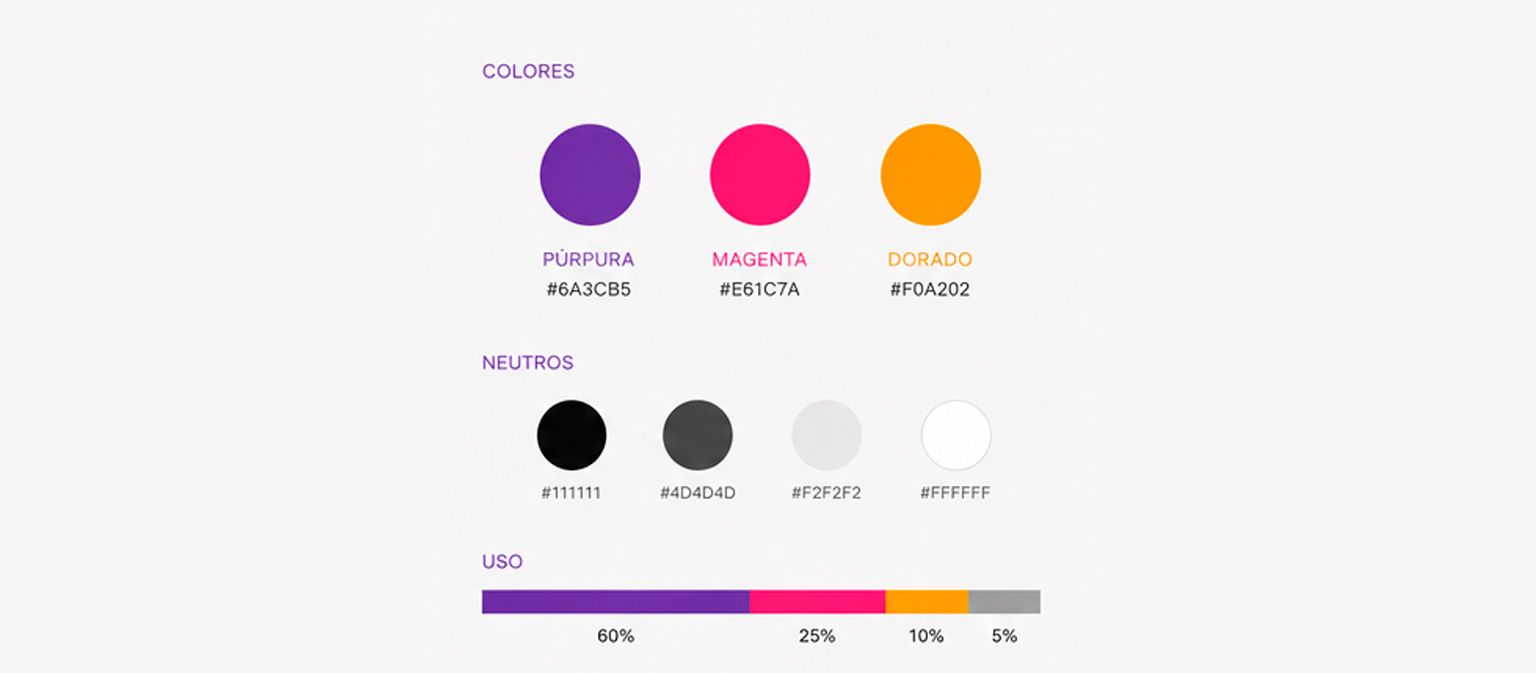
Colour system. Primary Purple (#6A3CB5), Solidarity Magenta (#E61C7A), and Community Gold (#F0A202), with neutral palette and usage ratios: 60% / 25% / 10% / 5%.
A visual vocabulary built from three primitives
Three graphic primitives — the diagonal stroke (Connection / Network), the chevron arch (Encounter / Support), and the rising line (Action / Movement) — repeat consistently across all service icons. This creates a cohesive set without being monotonous. UI icons extend the system into functional territory for digital touchpoints, available in outline and filled styles.
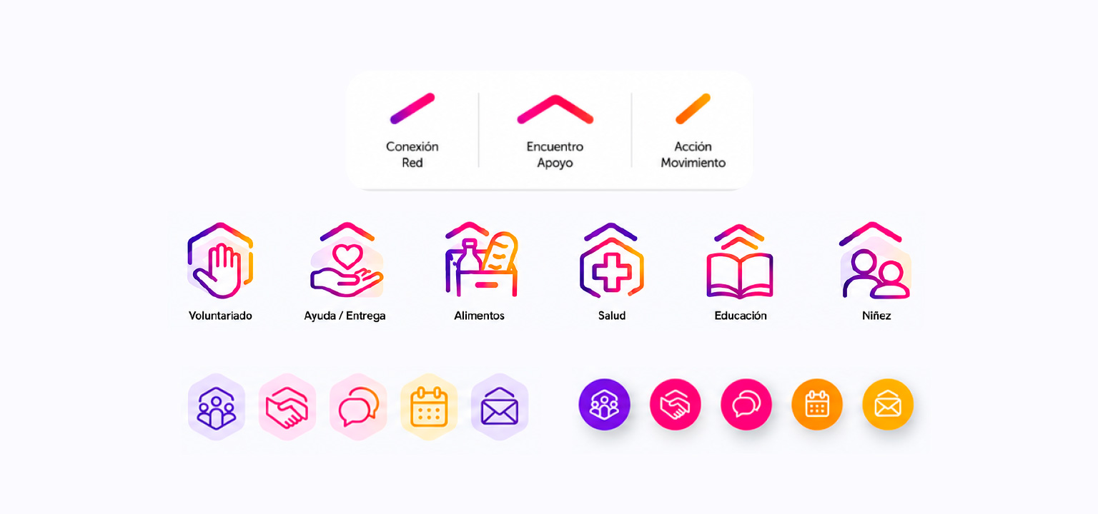
Icon system. Three graphic primitives as the foundation, six service icons (Volunteering, Aid, Food, Health, Education, Children), and UI icons in two styles for digital applications.
From symbol to graphic language
The hexagon expands into three pattern modes — hexagonal network, modular mosaic, and node connections — each serving a different communication context. Applied to social media, the system creates a consistent presence across eight posts covering the full arc of the organisation: launch, volunteer recruitment, community impact, and closure.
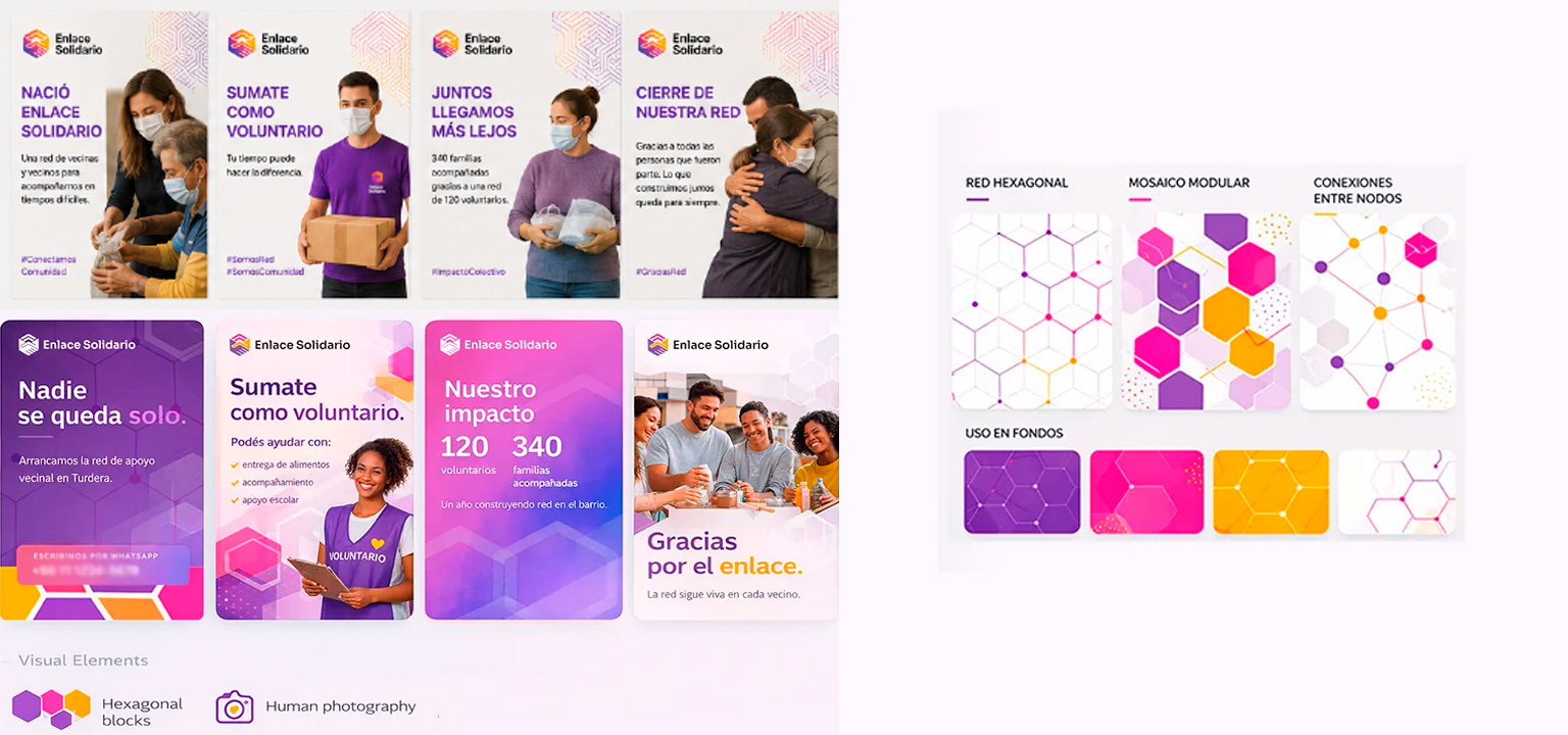
Social media posts across eight content moments and graphic system patterns — hexagonal network, modular mosaic, and node connections — with background colour usage examples.
Identity in the field
Volunteers were consistently shown with faces visible — a deliberate decision to maintain human connection even when masks were required. Merchandise served a dual function: making volunteers immediately identifiable in the neighbourhood and strengthening a shared sense of belonging within the network. The chevron pattern extends from the mark into garment and bag design, making the graphic system wearable.
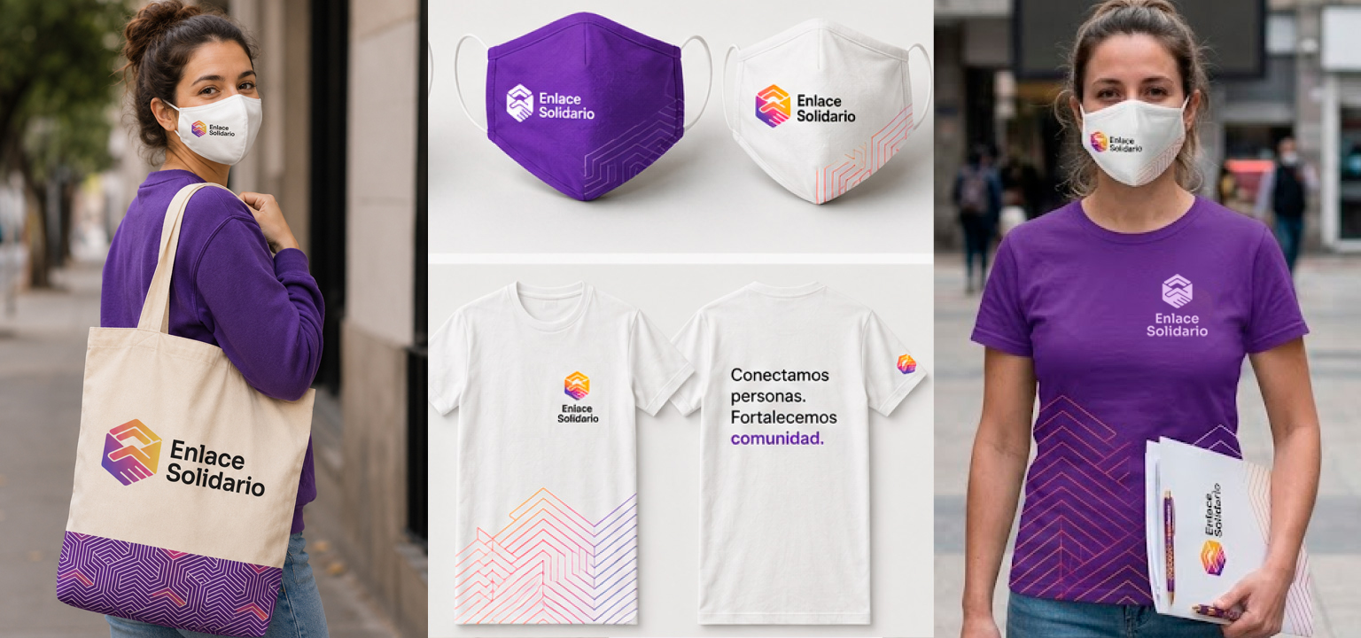
Identity applied across volunteer merchandise — tote bag, masks in purple and white, branded t-shirt with back copy "Conectamos personas. Fortalecemos comunidad.", and volunteer in the field with full kit.
Small org, complete system.
Enlace Solidario operated for two years and closed when the emergency passed. A complete identity system built for real-world action, helping a grassroots initiative communicate clearly, build trust quickly, and coordinate meaningful support at neighbourhood scale.